Six things you’re not doing (but should be doing) with your company’s website
New neighbors just moved in next door, so you decide to welcome them to the neighborhood by inviting them over to your home for a dinner party. Your goal is to make a good first impression, right? The same should hold true for your website.
You only have a short amount of time to grab a visitor’s attention. If you have a cluttered website without a clear message or call to action, folks won’t be sticking around for the main course. Here are six ways to improve your website and make your guests want to visit you again:
1. Value Proposition
The value proposition, or mission statement, tells your visitors what you do and why you do it. Set the tone early with a brief, to-the-point value proposition. Visitors should know exactly what they’ll get if they hire you, buy your product, subscribe to your newsletter or read your blog. If people don’t understand what your company does, who it does it for and how it does it differently, are they likely to stick around?
2. Intuitive Navigation
Your navigation should serve two main purposes: it should help the visitor quickly find what they’re looking for and it should increase your search engine ranking performance. You want someone to arrive and know exactly where they can find the information they want and need without being confused. Be human – use descriptive navigation terms instead of generic jargon or internal lingo. Use words that reflect your visitor’s typical behavior. It reduces time spent clicking around for the user and helps search engines determine your relevance.
3. Call to Action
You’ve got visitors to the website, they’re interested, now what should they do? When someone arrives on your website it should be clear what action you want them to take. Tell them!
An effective approach is using the WYLTIWLT test. Pronounced “wilty wilt,” WYLTIWLT is described as “…one practical solution is to say that the words on a button must make sense after both the interrogative ‘Would you like to…?’ (where the publisher speaks) as well as the conditional ‘I would like to…’ (where the user speaks).”
Don’t forget about color. Use an accent or contrasting color for your call-to-action buttons. If your site is predominantly blue or light blue, find a nice yellow or a warm orange that will draw the user’s attention to the button. If you can give your visitor a better idea of what they can click on and what might happen when they do, they’re going to be more likely to take the risk. Calls-to-action should be prominent.
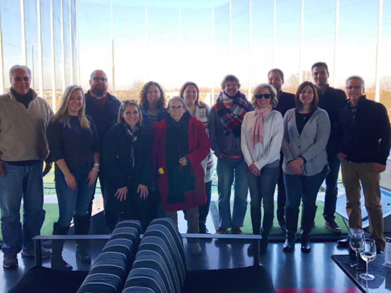
4. Original Images
Stock image sites are convenient, but they won’t build credibility for your company or engage your audience. The same can be said for low-quality or small images. High-quality images show professionalism and attention to detail, while using real photos of your team and office environment paints a realistic portrait of what people can expect when working with you.
5. Mobile-friendly
Having a mobile-friendly website is no longer optional. With good reason, Google updated its search algorithm to rank mobile web pages higher in mobile search results. Google want visitors to have a positive experience – so should you. If your website has tiny fonts/links and is hard to navigate, people won’t stick around, as being forced to do the pinch and zoom is not a pleasant experience.
6. Speed it up
We’re so used to broadband internet speeds that users now expect lightning-fast load times when browsing the web. If a page is too slow, they also know they can find similar content elsewhere. According to a Google poll, the top frustration when users browse the web on their mobile device is waiting for slow pages to load. Keep your users happy by optimizing your site for speed.
Make your images leaner by removing metadata. Avoid the overuse of web font variants. Stick to the SVG format, the preferred choice for multi-device and high-resolution icons. Keep CSS independent of HTML to treat content and design as separate concerns. At a minimum, aim for a page weight of less than 1mb.
If you’ve done all of this correctly, you gave your guests a good reason to come back and visit – or at least stick around for dessert. If you have any tricks or tips, we’d love to hear them in the comments below.